 |
|
| Manual |
|||||
The Beginning • Overview • Getting Started HammerKit Tools • The Component Editor • Understanding Component Types Component Templates Creating Content Component Advanced Component Settings • The Style Manager • Working with Styles & Colors Creating a New Style Adding a New Color • The File Manager Folder Actions File Actions • The Keyword Manager • Settings Manager • Data Manager Creating & Using Data Entering Data Output Data Elements HammerKit Elements • Creating Content with Elements • Adding text • Adding Images • Cut, Copy & Paste User Manager • Defining Users, Groups & Access Rights • Adding groups • Removing Groups HammerScript • Syntax • Constructors & Variables Scopes |
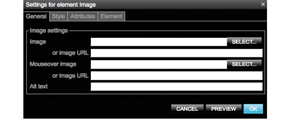
Adding images To add images to a component, drag the ʻImageʼ element to the canvas. The Settings box for the text element appears. From here you can specify:
a single image a mouse-over image, used when you want to create a roll- over effect the ʻaltʼ text to help describe the content of the image for accessibility and SEO purposes You can choose the image by clicking the select button or by entering a direct URL. The select button will open the file chooser dialogue so you can choose an image from the file manager or upload a new one. You can use the style tab to set a style for your image or choose a class that you have previously created using the Style Manager (LINK TO STYLE MANAGER part).
Selecting an element + click once on the element in the canvas. A box like this will appear around the element to let you know it is selected. + you can select multiple elements at once by holding CTRL on your keyboard and clicking the elements you wish to select
Editing an element
+ double-click on the element to display its properties box. + From here you can change the content, style and output options for the element. + change the properties and then click ʻSaveʼ to confirm your changes. + to preview how your changes will affect the element before you save them click ʻPreviewʼ + to move existing elements, click and drag the element on the canvas to the position you wish
Deleting an element
+ select the element(s) you would like to remove. The dotted redline will appear to indicate which have been selected. + click the button on the button bar at the top of the component editor. This will remove the elements from the canvas permanently. |
Product
|
Company
|
Community
|
Awards
|
|||||||||||||||||||||||||||||||||||||||||||||||||||||||||||||||||||||||||||||||


